Jetstream Design System
A comprehensive design reference extracted from and inferred from the native iOS/watchOS flight tracking app. Jetstream uses a bold, dark-first aesthetic with purple brand color and amber accent, built on Apple's SF Pro type system.
Brand Summary
Colors
Jetstream's color system spans brand purples, flight status colors, and iOS system colors.
Brand Colors
Text Colors
Status Colors (Marketing Site)
Status Colors (iOS App / System)
Gradients
Typography
Inter for the marketing site. SF Pro for the native app. Indie Flower for playful accents.
Font Families
| Name | Family | Usage |
|---|---|---|
| Primary (Web) | Inter, sans-serif | All marketing site text |
| Display (App) | SF Pro Display | Large headings, airport codes |
| Text (App) | SF Pro Text | Body text, labels |
| Accent | Indie Flower, cursive | Handwritten-style annotations |
| System | system-ui, -apple-system, ... | Fallback stack |
Type Scale
Font Weights
| Weight | Value | Usage |
|---|---|---|
| Regular | 400 | Body text, descriptions |
| Medium | 500 | Subheadings, emphasized text |
| Semibold | 600 | Buttons, labels, small headings |
| Bold | 700 | Headings, display text |
Spacing
Spacing scale extracted from paddings, margins, and gaps across the site.
Spacing Scale
Gap Values
| Token | Value | Usage |
|---|---|---|
| gap-xs | 4px | Tight inline spacing |
| gap-sm | 6px - 8px | Icon-to-text, compact lists |
| gap-md | 10px - 16px | Card content, form fields |
| gap-lg | 20px - 24px | Section content, card groups |
| gap-xl | 32px - 48px | Major section spacing |
| gap-2xl | 64px - 76px | Page-level section gaps |
Borders & Shadows
Rounded corners and layered shadow system for depth.
Border Radii
Box Shadows
Buttons
Pill-shaped buttons with bold fills. Primary CTA uses white on dark sections, black on light.
Primary Buttons
| Variant | Background | Color | Radius | Padding |
|---|---|---|---|---|
| White (on dark bg) | #FFFFFF | #000000 | 40px | 12px 18px 12px 20px |
| Black (on light bg) | #000000 | #FFFFFF | 40px | 12px 18px 12px 20px |
| Accent | #F7BE00 | #000000 | 50px | 12px 20px |
| Purple | #6100FF | #FFFFFF | 40px | 12px 20px |
Button Sizes
App Store Button
Outline / Ghost
Cards
Clean card surfaces with layered shadows and generous padding. The marketing site uses subtle card-like sections.
Import your flights
Forward your confirmation email or connect your calendar to import flights instantly.
Pilot-grade data
Live streaming flight data with actual flight plans, tail numbers, and more.
Dark Mode
The app is dark-mode-first. The marketing site uses dark sections extensively.
iOS Dark Mode Surfaces
Dark Text Hierarchy
#FFFFFFrgba(255,255,255,0.8)rgba(255,255,255,0.6)rgba(255,255,255,0.4)rgba(255,255,255,0.15)App UI Patterns
Native iOS flight tracking interface patterns inferred from marketing screenshots and App Store listing.
Flight Cards
The core UI element. Displays departure/arrival airports, times, status, and flight path visualization.
On Time state
Delayed state
Cancelled state
En Route state (active tracking)
| Element | Style |
|---|---|
| Card Background | #1C1C1E (iOS secondary system background) |
| Card Radius | 16px |
| Card Padding | 20px |
| Airport Codes | 32px / Bold / SF Pro Display |
| City Names | 13px / rgba(255,255,255,0.5) |
| Times | 20px / Semibold |
| Detail Labels | 11px / Uppercase / rgba(255,255,255,0.4) |
| Airline Logo | 32px circle with brand color |
| Status Badge | 6px radius / 12px semibold / status color bg at 15% opacity |
Status Indicators
| Status | Color | Background |
|---|---|---|
| On Time | #34C759 | rgba(52,199,89,0.15) |
| Delayed | #FF9500 | rgba(255,149,0,0.15) |
| Cancelled | #FF3B30 | rgba(255,59,48,0.15) |
| En Route | #007AFF | rgba(0,122,255,0.15) |
| Landed | #34C759 | rgba(52,199,89,0.15) |
| Boarding | #5856D6 | rgba(88,86,214,0.15) |
Flight Timeline
Vertical timeline showing flight progress events.
Map View
Dark satellite-style map with purple flight path arc.
| Property | Value |
|---|---|
| Background | Dark satellite/terrain (#0a1628) |
| Flight Path | Curved arc, purple/blue (#6100FF at 60% opacity) |
| Airport Dots | White with glow shadow |
| Vignette | Radial gradient fade at edges |
Live Activity & Dynamic Island
Real-time flight tracking on Lock Screen and Dynamic Island.
| Component | Details |
|---|---|
| Live Activity | Airport codes + progress bar + remaining time. Bg: #1C1C1E, radius: 20px |
| Dynamic Island (compact) | Minimal codes + progress. Bg: black, radius: 22px |
| Dynamic Island (expanded) | Full map + departure/arrival + status |
| Progress Bar | Track: rgba(255,255,255,0.1), Fill: #6100FF, height: 4px |
Apple Watch
Home Screen Widgets
| Property | Value |
|---|---|
| Background | Gradient: #120036 to #250160 |
| Corner Radius | 22px (iOS widget standard) |
| Padding | 16px |
| Title | 11px / 500 / rgba(255,255,255,0.6) |
Tab Bar
| Property | Value |
|---|---|
| Background | rgba(30,30,30,0.95) with blur(20px) |
| Active Tint | #6100FF (brand purple) |
| Inactive | #8E8E93 (iOS secondary) |
| Icon Size | 22px |
| Label Size | 10px / 500 weight |
| Border Top | 1px solid rgba(255,255,255,0.08) |
Notifications
Layout
Responsive layout system from the marketing site.
| Property | Value |
|---|---|
| Max Width | 1200px |
| Desktop Breakpoint | > 1200px |
| Tablet Breakpoint | 840px |
| Mobile Breakpoint | 789px |
| Content Padding (Desktop) | 48px |
| Content Padding (Mobile) | 20px |
| Section Gap | 64px - 76px |
| Grid System | Flexbox-based, not CSS Grid |
Motion & Interaction
Subtle, purposeful animations. Framer Motion powers the marketing site.
Interaction Patterns
| Pattern | Details |
|---|---|
| Button Hover | translateY(-1px) + subtle background darken |
| Card Hover | Slight elevation increase (shadow change) |
| Page Transitions | Framer Motion scroll-linked animations |
| Scroll Reveal | Fade-in + translateY on viewport entry |
| App: Pull to Refresh | Custom refresh animation with plane icon |
| App: Flight Progress | Animated plane along arc path |
| App: Status Changes | Color transition with haptic feedback |
| Transition Duration | 0.2s default, 0.3s for larger elements |
| Easing | ease (CSS default), spring physics in app |
Interactive Demo
Product Screenshots
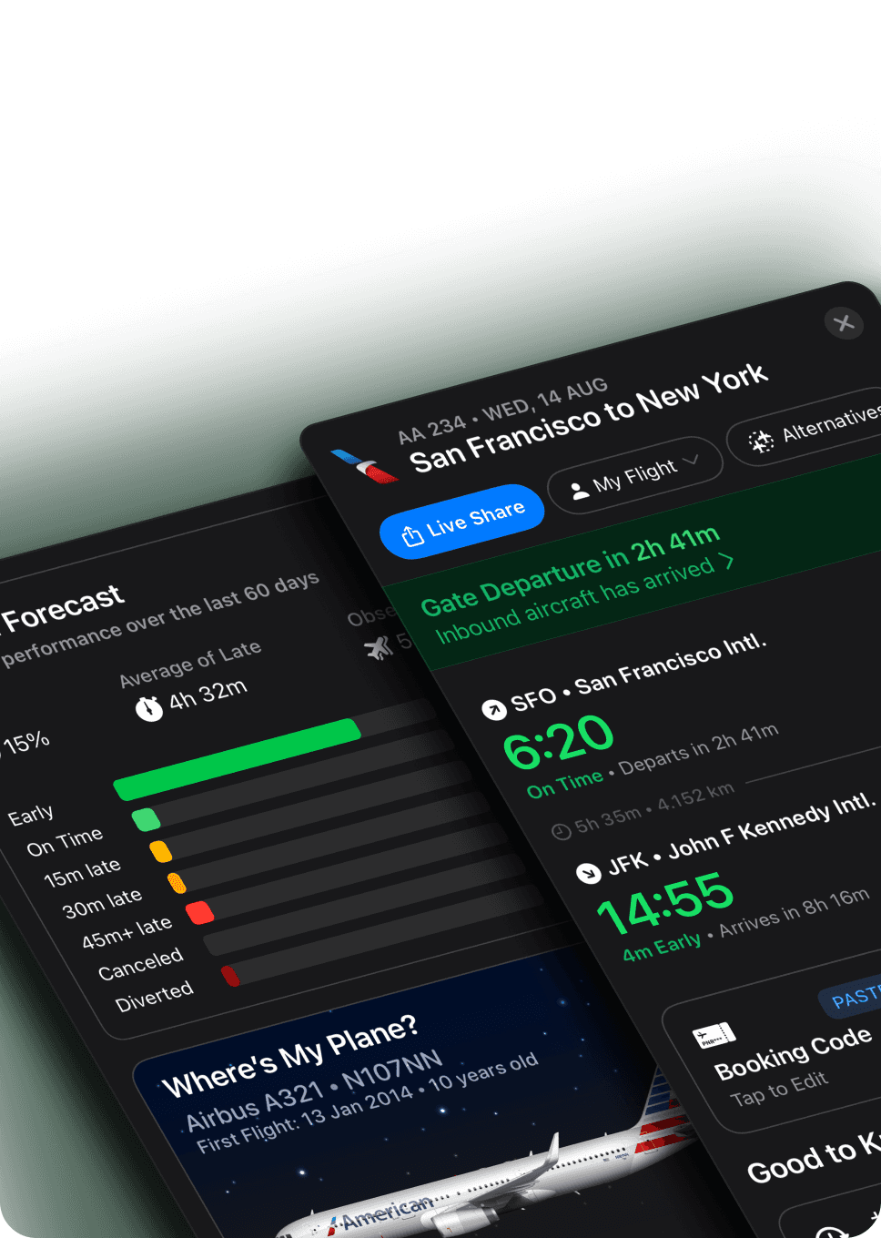
App screenshots from the marketing site showing the native iOS interface.







Tailwind Mapping
The paired JSON export now includes a tailwind section with theme extensions and component recipes. Use these mappings instead of default Tailwind tokens when recreating this system.
// tailwind.config.js
import designSystem from './design-system.json';

export default {
  theme: {
    extend: designSystem.tailwind.theme.extend,
  },
};

// Also reuse designSystem.tailwind.componentRecipes for common surfaces.
| Scope | Primary | Body Font | Radius | Shadow | Breakpoint |
|---|---|---|---|---|---|
| Design System | #6100FF | — | — | — | {'max': '789px'} |
| Scope | Recipe | Class Pattern | Notes |
|---|---|---|---|
| Design System | buttonPrimary | inline-flex items-center justify-center gap-2 rounded-md bg-brand-primary text-text-inverse shadow-sm px-4 py-2 font-semibold transition-colors | Primary action button using exported brand, radius, and shadow tokens. |
| Design System | surfaceCard | rounded-md bg-surface-base text-text-primary border border-border-subtle shadow-sm p-6 | Default surface/card treatment for high-visibility content areas. |
| Design System | inputField | rounded-md border border-border-subtle bg-surface-base text-text-primary px-3 py-2 focus:outline-none focus:ring-2 focus:ring-focus-ring | Base text input treatment aligned to the exported radius, border, and focus tokens. |